Module Library for Dreamforce by Salesforce
Dreamforce is Salesforce's flagship annual conference, bringing together customers, partners, developers, and industry leaders to share ideas, innovations, and the future of technology.
As part of the design team, I helped build a modular design system for the Dreamforce website, aimed at modernizing the site experience through a flexible, reusable component library. Every module was designed based on performance data, informing the module flow, page layouts, and CTA placement to keep visitors converting at each scroll depth.
The system included a scalable component library with variables and flexible design patterns, enabling future designers to quickly create new pages by combining modules like building blocks while maintaining a consistent visual language across the Dreamforce experience.
Type
Brand Identity
, UI/UX Design
Date
March - June 2026
Role
Designer

Hero Section
The hero opens with a live countdown timer at the top of the page, signaling the pricing deadline from the very first fold. As the user scrolls, the timer transitions into a persistent floating module in the bottom right corner, paired with a "Register Now" CTA and a dismiss option. This ensures the urgency messaging and conversion path remain accessible throughout the entire scroll, rather than being confined to the hero - while still giving users control to dismiss it if preferred.
Content Cards
The content cards section was built as a highly flexible module, with each card supporting a combination of image, video, header, text, and CTA elements. Cards can be arranged in rows of one, two, three, or four, allowing the layout to adapt to varying content density and messaging priorities across the page.
As the user scrolls, each row animates into view, creating a paced, engaging reveal rather than presenting all the content at once.
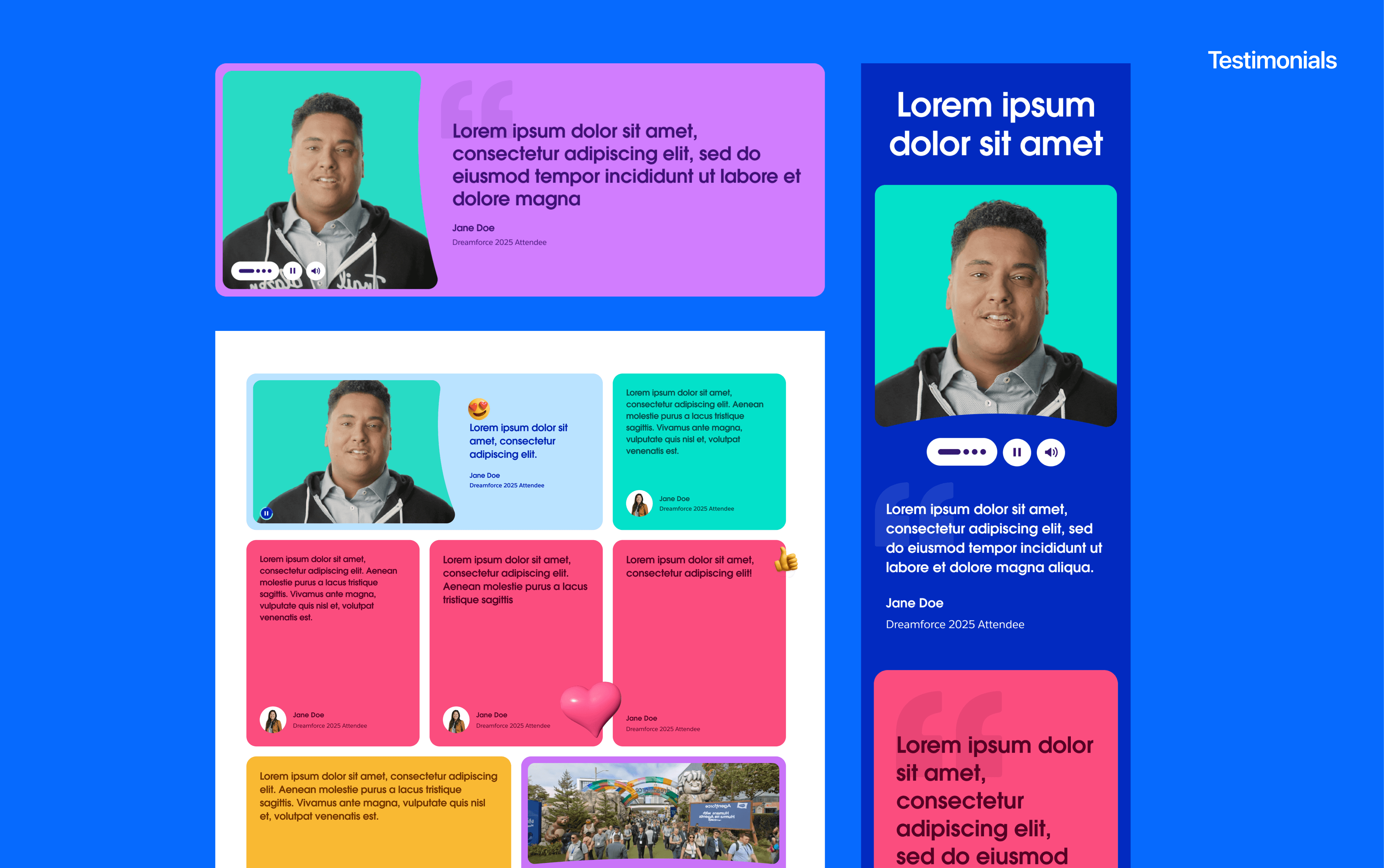
Testimonials
The testimonials module follows the same flexible, row-based approach, with rows of two or three testimonials appearing as the user scrolls. Each testimonial card supports video, image, or text content, allowing the module to mix formats.
50/50
The 50/50 module splits the page into two equal columns: one for a headline, body copy, and CTA, and the other for a supporting image or video. The layout is flexible in that it can flip orientation, with the media positioned on the left or right depending on the page's visual rhythm, letting designers alternate sides across multiple 50/50 sections to keep a long page from feeling repetitive.

Agenda
The agenda module uses a tabbed day-selector. Selecting a day updates the content below it. Instead of forcing users to scroll through content for every single day, the selector collapses all of that into one compact, reusable space, saving space and making it effortless to jump straight to the day that matters to them.
Pricing
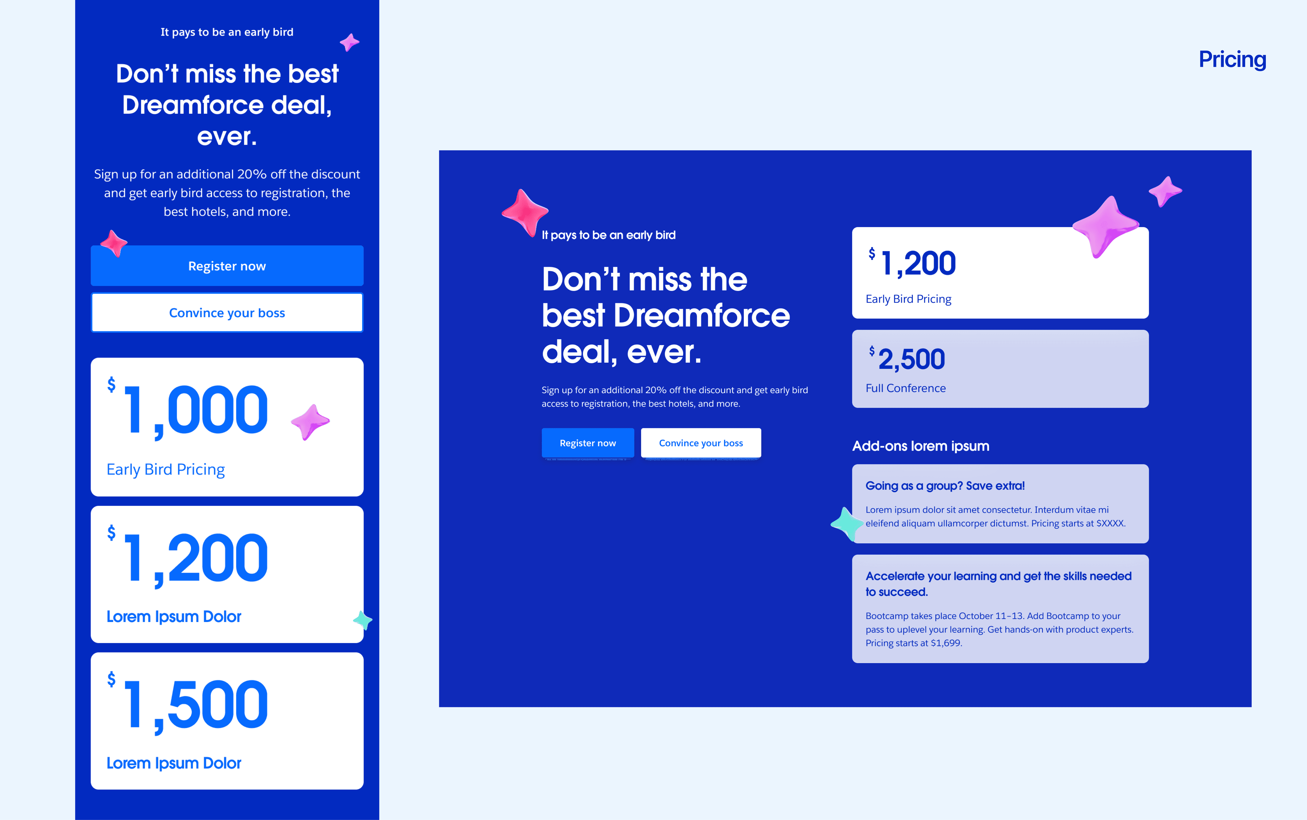
The pricing module keeps the left panel sticky, while the right column with pricing tiers and add-ons scrolls independently. The module also lets one pricing card be visually featured over the others, making it easy to highlight whichever tier the team wants to prioritize, like early bird pricing.
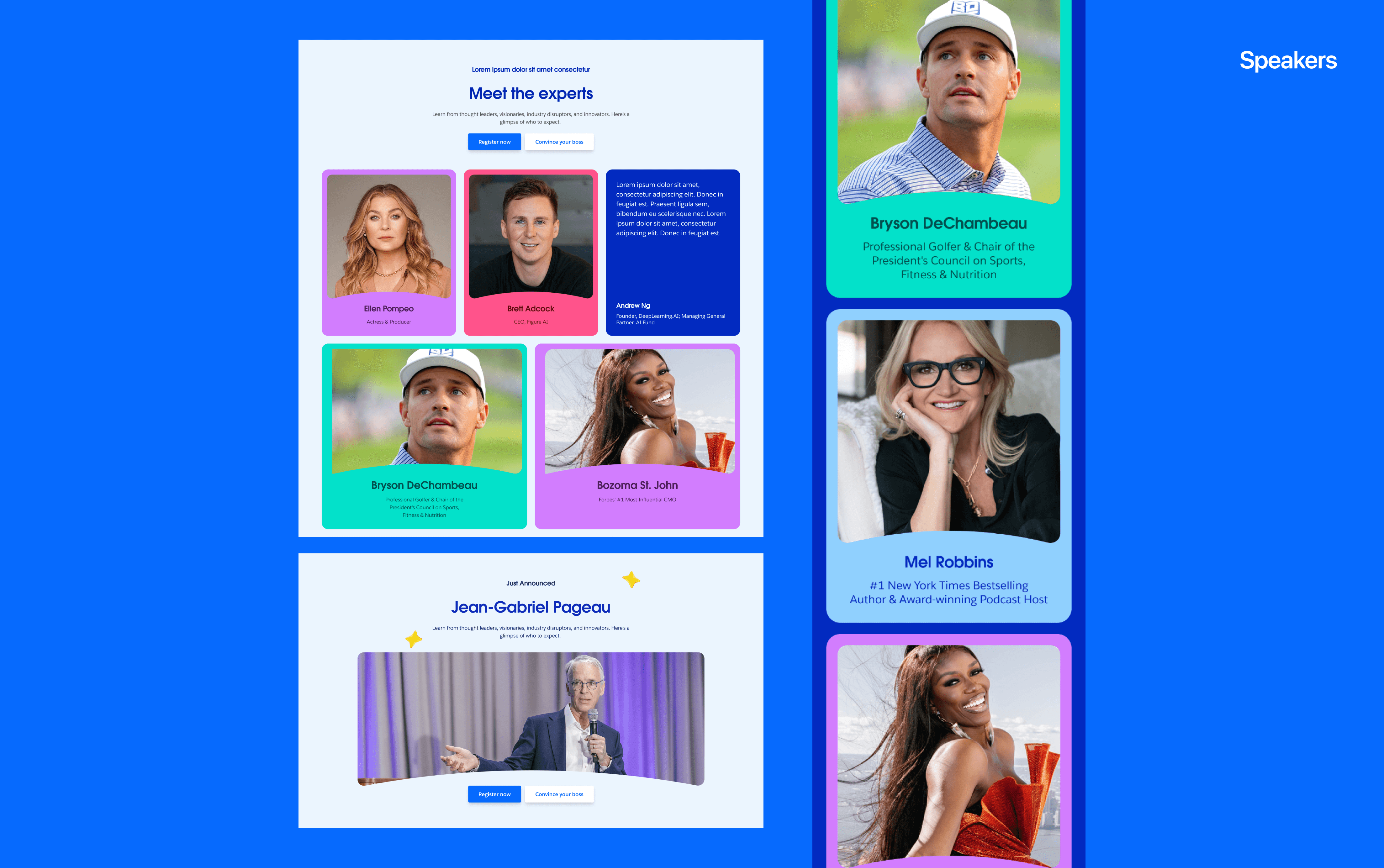
Speakers
The speakers module closes out the home page, presenting speaker cards in flexible rows of one, two, or three. Each card uses a flip-on-hover interaction: the front displays the speaker's photo, name, and role, while hovering reveals the back of the card with a full bio. This keeps the initial view clean and scannable, letting users quickly browse speakers by face and title.